In this chapter we look at a way of fitting a longitudinal growth model that allows for a nonlinear curve that you do not parameterize. This is a useful tool for longitudinal data that shows up a lot in the final projects. That said, this approach only works if you are working with your data in waves.
We will illustrate with the National Youth Survey (NYS) data as described in Raudenbush and Bryk, page 190. This data comes from a survey in which the same students were asked yearly about their acceptance of 9 “deviant” behaviors (such as smoking marijuana, stealing, etc.). We analyze the first 5 years of data, and have ATTIT (attitude towards deviance) and EXPO (“exposure”, based on asking the children how many friends they had who had engaged in each of the “deviant” behaviors). See Chapter 5 for more information on the data.
Our modeling approach has two key ideas. The first is to let each year have its own mean. The second is to then “tilt” our curves to fit each student as best we can.
39.1 A nonparametric growth model
For the first idea, we make each age a factor, and then fit our model:
lmer(formula = ATTIT ~ 0 + age_fac + (1 | ID), data = nys1)
          coef.est coef.se
age_fac11 0.21     0.02
age_fac12 0.23     0.02
age_fac13 0.33     0.02
age_fac14 0.41     0.02
age_fac15 0.45     0.02

Error terms:
 Groups   Name        Std.Dev.
 ID       (Intercept) 0.19
 Residual             0.18
---
number of obs: 1079, groups: ID, 239
AIC = -192.2, DIC = -272
deviance = -239.2
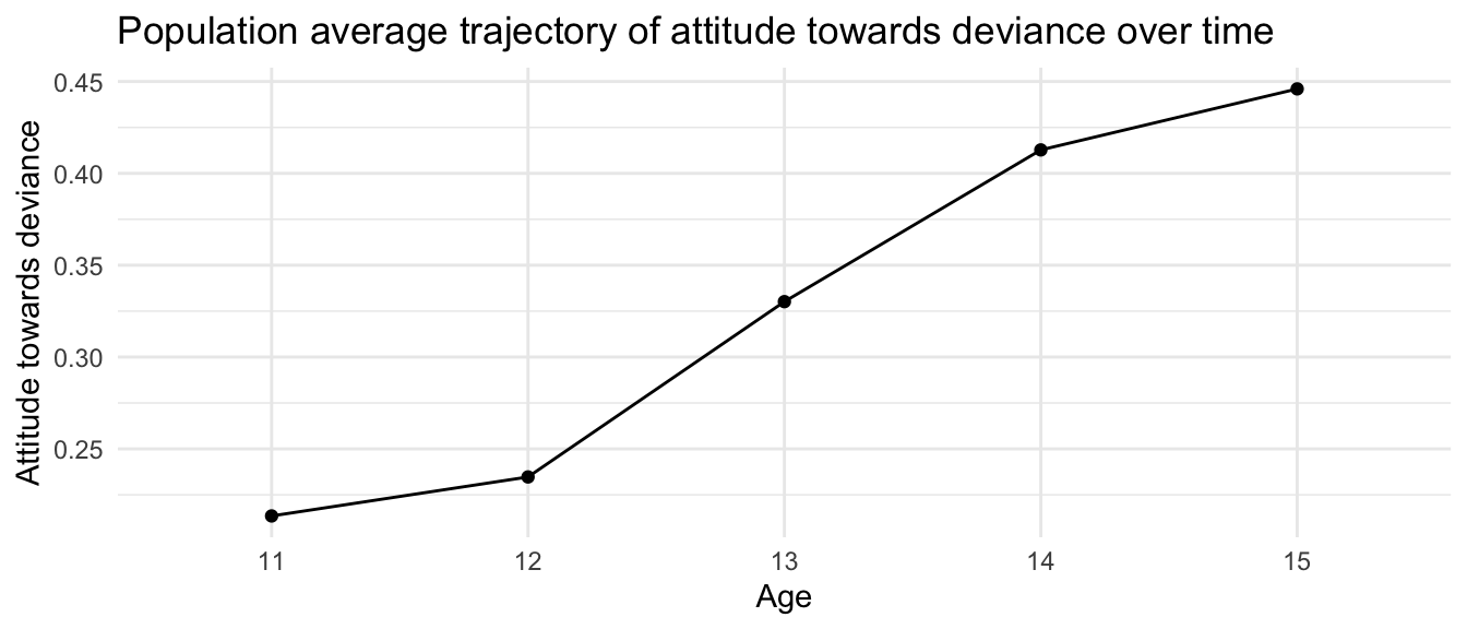
Note how each wave (here age) has its own mean across our coefficients.
We can then plot our population average trajectory:
newdata <- nys1 %>% dplyr::select( age_fac ) %>%unique()newdata$ID =-1newdata$ATTIT <-predict(M0, newdata=newdata, re.form=NA)ggplot(newdata, aes(age_fac, ATTIT, group=ID)) +geom_line() +geom_point() +labs(title ="Population average trajectory of attitude towards deviance over time",x ="Age",y ="Attitude towards deviance")
The problem with this model is that it does not allow for individual trajectories for each student. All the individual kids all grow exactly the same, which might not be in line with what the data would actually show. We are only allowing for an intercept shift. We want to extend this model so that each student can have their own growth trajectory; we do this next.
39.2 Adding random slopes
Even though we have fixed effects for growth, we can still let each student have their own random slope for growth rate, which will “tilt” our nonparameteric curve for each student. We do this by having a random slope on the continuous age variable, even though our fixed effects are on the factor age variable. We center age around the beginning of the study, so our random intercepts correspond to ATTIT at age 11.
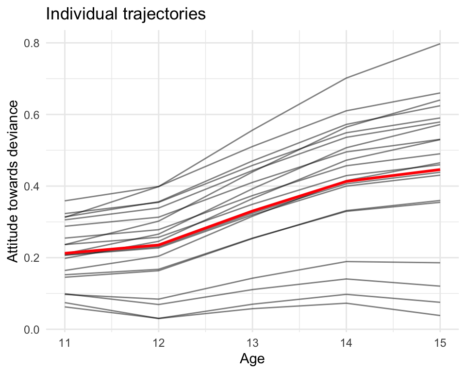
We next predict the values for each student and plot those predicted values:
smp_dat$pred <-predict(M1, newdata=smp_dat)# Make a population reference curvenewdata$age =11:15newdata$age_c =0:4newdata$pred <-predict(M1, newdata=newdata, re.form=NA)ggplot(smp_dat, aes(age, pred)) +geom_line( aes( group=ID ), alpha=0.5) +labs(title ="Individual trajectories",x ="Age",y ="Attitude towards deviance") +geom_line( data = newdata, col="red", linewidth=1 )
Note how all our students have the same shape of our overall trajectory, but some are slightly steeper and some more shallow. This allows us to have a shared shape that we can shift (random intercept) and tilt (random slope) to fit the actual data.
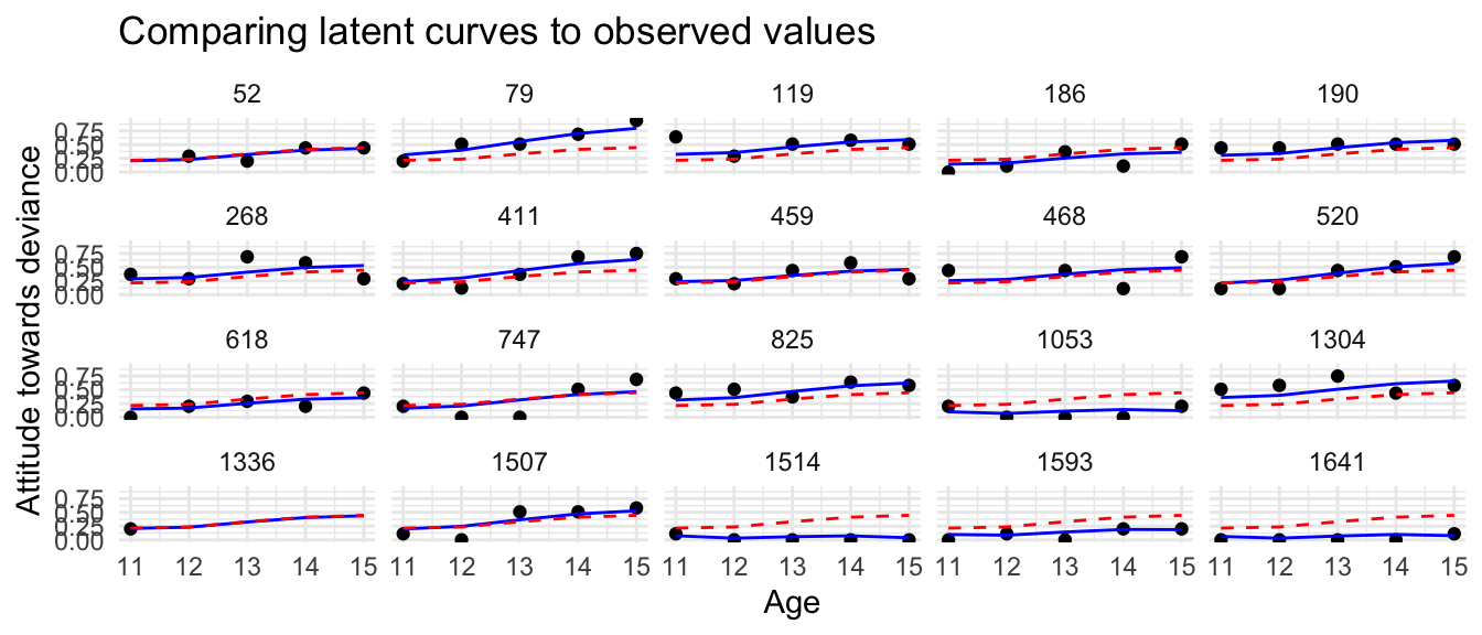
Compare our trajectories to the measured values:
newdata$ID =NULLggplot(smp_dat, aes(age, ATTIT)) +facet_wrap( ~ ID ) +geom_point() +geom_line( aes( y = pred ), col="blue" ) +labs(title ="Comparing latent curves to observed values",x ="Age",y ="Attitude towards deviance") +geom_line( data = newdata, col="red", lty=2 )
We can see how the latent curves are trying to get close to the observed data for each student. Our fit seems reasonable, but not perfect.
39.3 And the math?
Writing the math can be tricky for this model. We do not have an intercept anymore, but instead have a different fixed effect for each time point.
We could write our level 1 model with those individual fixed effects for each time point, and a linear growth on top of it:
Level 1: We have for individual \(i\) at time \(t\):
\[ Y_{ti} = \beta_{t} + \beta_{0i} + \beta_{1i} ( age_{ti} - L ) + \epsilon_{ti} \] The \(\beta_{t}\) here are the fixed effects for each time point (age).
Level 2: We can then write for level 2 (assuming we have some individual level covariate \(X_i\)):
\[
\begin{aligned}
\beta_{0i} &= \gamma_{01} X_i + u_{0i} \\
\beta_{1i} &= \gamma_{11} X_i + u_{1i}
\end{aligned}
\] Note we do not have any \(\gamma_{00}\) or \(\gamma_{10}\)—this is because our population curve is captured by the \(\beta_t, t = 1, \ldots, 5\). In other words, the growth curve is relative growth around the fixed effects, and is implicitly zero-centered.
39.4 Conclusion
Hopefully this tool of a nonparameteric curve is useful for examining how different waves of data may be different from one another. For example, if COVID happened in the middle of your study, you might expect a big shift in the data. This model allows you to model that shift while still allowing for different individual growth trajectories over time.