# load libraries
library(tidyverse)
library(lme4)
library(ggeffects)
library(sjPlot)
library(haven)

# clear memory
rm(list = ls())

# load HSB data
hsb <- read_dta("data/hsb.dta")15 Easy viz for multilevel models with ggeffects
An awesome convenience function for graphing regression models is the ggeffects package. It is the best equivalent we have found in R to Stata’s margins. We demonstrate with the HSB data.
To show off ggeffects we first fit some models with 2- and 3-way interactions. Such complex models can be hard to interpret from the coefficients alone (unless you have a lot of practice).
m1 <- lmer(mathach ~ ses + (1|schoolid), hsb)
m2 <- lmer(mathach ~ ses + sector + (1|schoolid), hsb)
m3 <- lmer(mathach ~ ses*sector + (1|schoolid), hsb)
m4 <- lmer(mathach ~ ses*sector*female + (1|schoolid), hsb)

# tabulate results with tab_model
tab_model(m1, m2, m3, m4,
          p.style = "stars",
          show.ci = FALSE,
show.se = TRUE)| mathach | mathach | mathach | mathach | |||||
|---|---|---|---|---|---|---|---|---|
| Predictors | Estimates | std. Error | Estimates | std. Error | Estimates | std. Error | Estimates | std. Error |
| (Intercept) | 12.66 *** | 0.19 | 11.72 *** | 0.23 | 11.80 *** | 0.23 | 12.41 *** | 0.25 |
| ses | 2.39 *** | 0.11 | 2.37 *** | 0.11 | 2.95 *** | 0.14 | 2.73 *** | 0.19 |
| sector | 2.10 *** | 0.34 | 2.14 *** | 0.34 | 2.16 *** | 0.38 | ||
| ses × sector | -1.31 *** | 0.21 | -1.26 *** | 0.30 | ||||
| female | -1.16 *** | 0.21 | ||||||
| ses × female | 0.34 | 0.26 | ||||||
| sector × female | -0.05 | 0.35 | ||||||
| (ses × sector) × female | -0.05 | 0.40 | ||||||
| Random Effects | ||||||||
| σ2 | 37.03 | 37.04 | 36.84 | 36.63 | ||||
| τ00 | 4.77 schoolid | 3.69 schoolid | 3.69 schoolid | 3.40 schoolid | ||||
| ICC | 0.11 | 0.09 | 0.09 | 0.09 | ||||
| N | 160 schoolid | 160 schoolid | 160 schoolid | 160 schoolid | ||||
| Observations | 7185 | 7185 | 7185 | 7185 | ||||
| Marginal R2 / Conditional R2 | 0.077 / 0.182 | 0.114 / 0.195 | 0.118 / 0.199 | 0.127 / 0.202 | ||||
| * p<0.05 ** p<0.01 *** p<0.001 | ||||||||
15.1 Graph the Results with ggeffects
If we just call ggeffect on the model object, we get a bunch of predicted values:
ggeffect(m1)$ses
# Predicted values of mathach
ses | Predicted | 95% CI
------------------------------
-4 | 3.10 | 2.19, 4.00
-3 | 5.49 | 4.77, 6.21
-2 | 7.88 | 7.32, 8.43
-1 | 10.27 | 9.85, 10.69
0 | 12.66 | 12.29, 13.03
1 | 15.05 | 14.62, 15.47
2 | 17.44 | 16.88, 17.99
3 | 19.83 | 19.10, 20.55
attr(,"class")
[1] "ggalleffects" "list"
attr(,"model.name")
[1] "m1"We can pipe that into plot to get a nice plot:
ggeffect(m1) |>
  plot()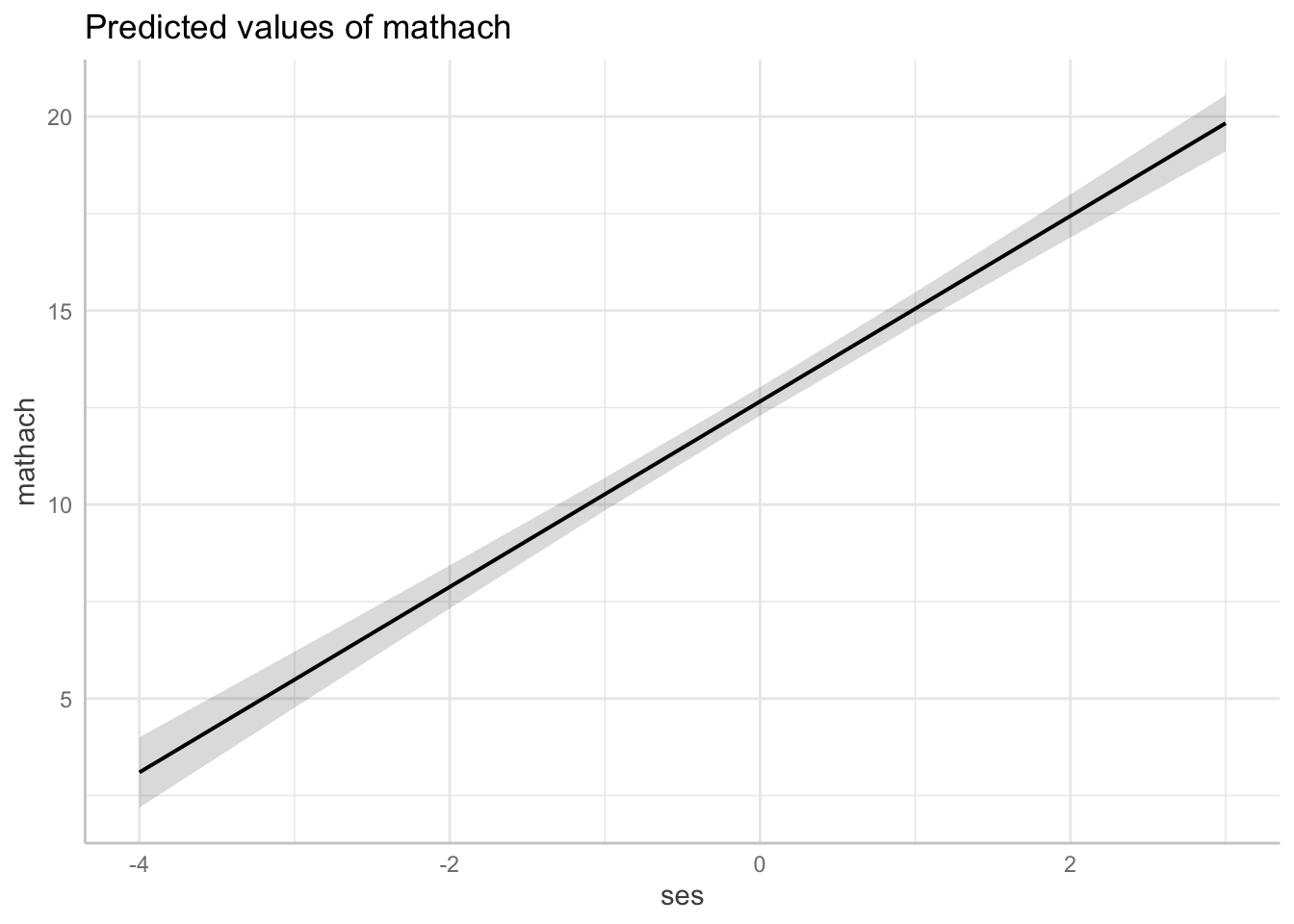
With multiple covariates, we can use the terms argument, which allows us to aggregate our data within different groups. The first term will be our \(x\)-axis, the second will get mapped to color, the third to facet. This makes visualizing our interactions super easy! Any covariates included in the model but not included in terms are held constant at their means.
ggeffect(m2, terms = c("ses", "sector")) |>
  plot(show_ci = FALSE, show_data = TRUE)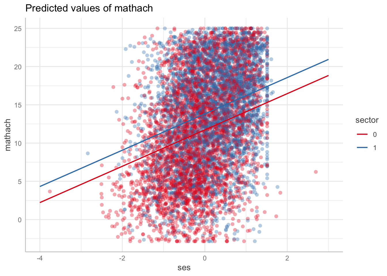
ggeffect(m3, terms = c("ses", "sector")) |>
  plot(show_ci = FALSE)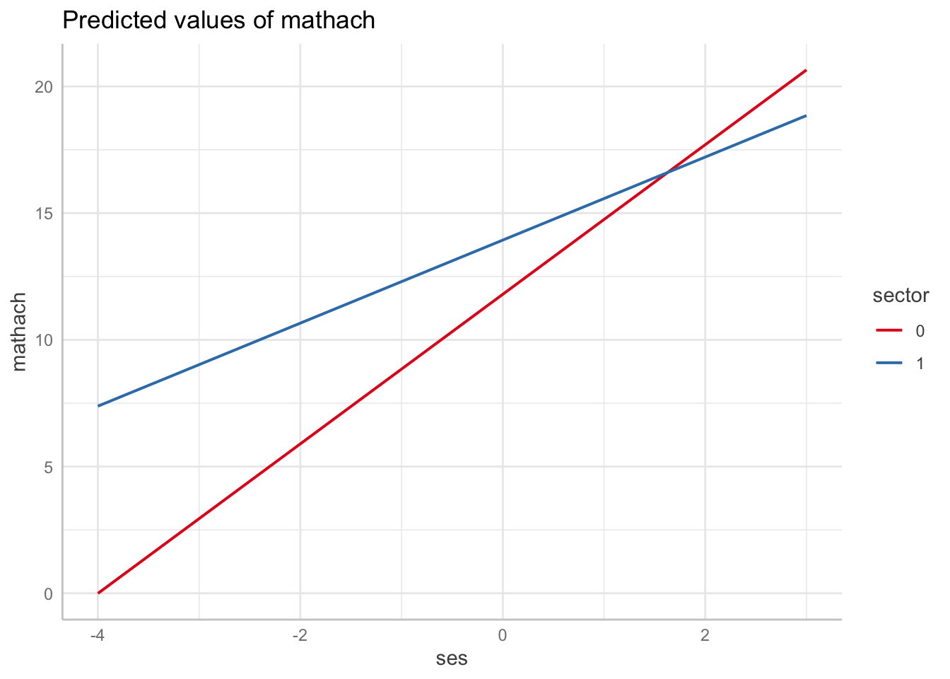
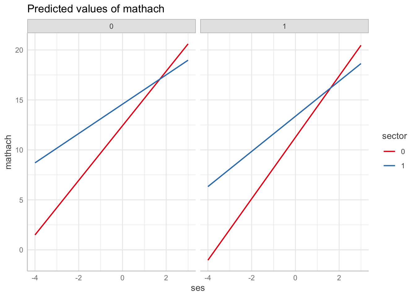
ggeffect(m4, terms = c("ses", "sector", "female")) |>
  plot(show_ci = FALSE)