16  Coefficient Plots

Coefficient plots provide a visually intuitive way to present the results of regression models. By displaying each coefficient along with its confidence interval, we can quickly discern the significance and magnitude of each coefficient.

As usual, we will turn to the tidyverse to make our plots. We will use the broom.mixed package to quickly get our coefficients, and then ggplot to make a nice plot of them. This is a great plot for a lot of final projects.

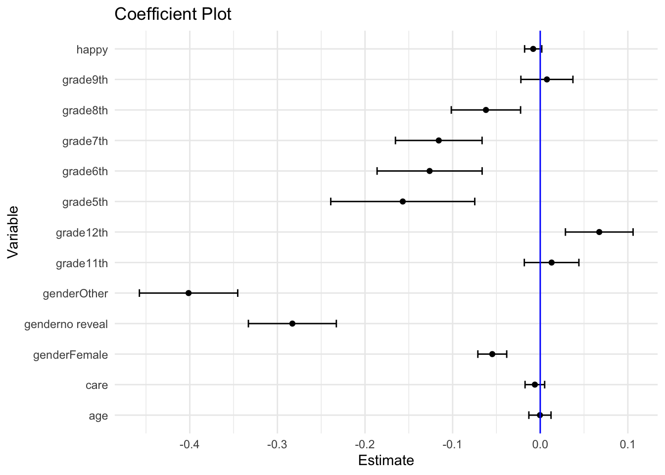
To illustrate, say we have a fit multilevel model such as this one on the Making Caring Common Data (the specific model here is not the best choice for doing actual research):

arm::display( fit )
lmer(formula = esafe ~ age + grade + gender + happy + care + 
    (1 | ID), data = dat)
                coef.est coef.se
(Intercept)      3.50     0.20  
age              0.00     0.01  
grade11th        0.01     0.03  
grade12th        0.07     0.04  
grade5th        -0.16     0.08  
grade6th        -0.13     0.06  
grade7th        -0.12     0.05  
grade8th        -0.06     0.04  
grade9th         0.01     0.03  
genderno reveal -0.28     0.05  
genderOther     -0.40     0.06  
genderFemale    -0.05     0.02  
happy           -0.01     0.01  
care            -0.01     0.01  

Error terms:
 Groups   Name        Std.Dev.
 ID       (Intercept) 0.25    
 Residual             0.65    
---
number of obs: 7666, groups: ID, 39
AIC = 15291.2, DIC = 15103.4
deviance = 15181.3 

We first tidy up the model output:

library( broom.mixed )
tidy_fit <- tidy(fit)
tidy_fit
# A tibble: 16 × 6
   effect   group    term             estimate std.error statistic
   <chr>    <chr>    <chr>               <dbl>     <dbl>     <dbl>
 1 fixed    <NA>     (Intercept)      3.50       0.204     17.2   
 2 fixed    <NA>     age             -0.000331   0.0126    -0.0261
 3 fixed    <NA>     grade11th        0.0130     0.0311     0.417 
 4 fixed    <NA>     grade12th        0.0674     0.0386     1.74  
 5 fixed    <NA>     grade5th        -0.157      0.0822    -1.91  
 6 fixed    <NA>     grade6th        -0.126      0.0600    -2.11  
 7 fixed    <NA>     grade7th        -0.116      0.0494    -2.34  
 8 fixed    <NA>     grade8th        -0.0620     0.0395    -1.57  
 9 fixed    <NA>     grade9th         0.00762    0.0297     0.257 
10 fixed    <NA>     genderno reveal -0.283      0.0502    -5.64  
11 fixed    <NA>     genderOther     -0.401      0.0561    -7.15  
12 fixed    <NA>     genderFemale    -0.0547     0.0165    -3.32  
13 fixed    <NA>     happy           -0.00805    0.00980   -0.821 
14 fixed    <NA>     care            -0.00613    0.0112    -0.548 
15 ran_pars ID       sd__(Intercept)  0.249     NA         NA     
16 ran_pars Residual sd__Observation  0.647     NA         NA     

We then select which coefficients we want on our plot:

tidy_fit = filter( tidy_fit,
                   is.na(group),
                   term != "(Intercept)" )

Finally, we make the coefficient plot:

ggplot(tidy_fit, aes(x=term, y=estimate)) +
  geom_point() +
  geom_errorbar(aes(ymin=estimate - std.error, ymax=estimate + std.error), width=0.25) +
  coord_flip() +
  labs(title="Coefficient Plot", y="Estimate", x="Variable") +
  geom_hline( yintercept = 0, col="blue" ) +
  theme_minimal()

Coefficient Plot for mtcars dataset

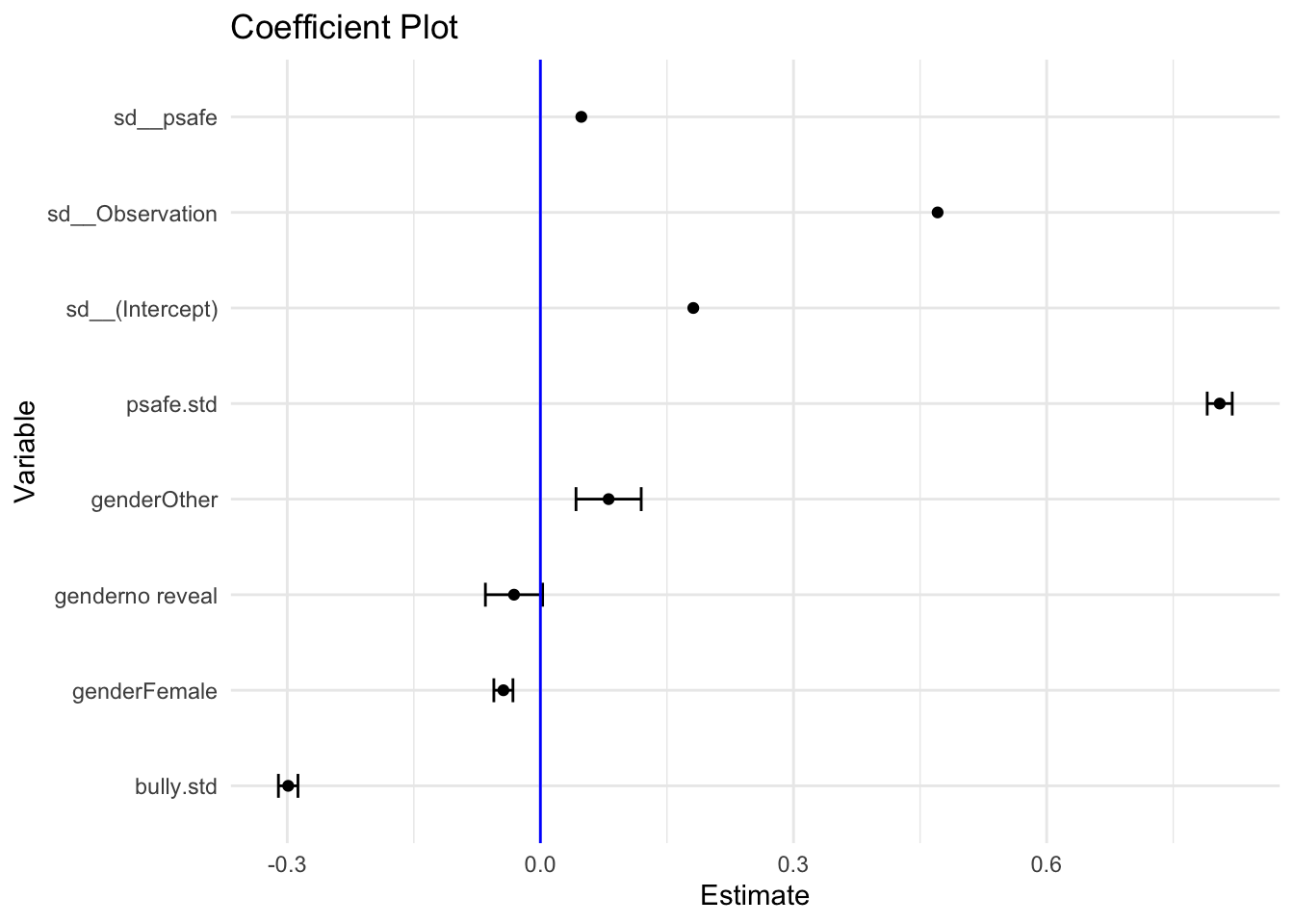
In general you will want to make sure your plotted variables are on a similar scale, e.g., all categorical levels or, if continuous, standardized on some scale. Otherwise the points will be hard to compare to one another.

To do this we might standardsize continuous variables like so:

dat <- dat %>%
  filter( !is.na(bully), !is.na(psafe), !is.na(esafe) ) %>%
  mutate(  esafe.std = (esafe - mean(esafe) / sd(esafe) ),
           bully.std = (bully - mean(bully) / sd(bully) ),
               psafe.std = (psafe - mean(psafe) / sd(psafe) ) )

We can then fit a new coefficient plot for a new model:

fit = lmer( esafe.std ~ gender + bully.std + psafe.std + (1+psafe|ID),
          data=dat )
tidy_fit <- tidy(fit)
tidy_fit = filter( tidy_fit,
                   term != "(Intercept)",
                   term != "cor__(Intercept).psafe" )

ggplot(tidy_fit, aes(x=term, y=estimate)) +
  geom_point() +
  geom_errorbar(aes(ymin=estimate - std.error, ymax=estimate + std.error), width=0.25) +
  coord_flip() +
  labs(title="Coefficient Plot", y="Estimate", x="Variable") +
  geom_hline( yintercept = 0, col="blue" ) +
  theme_minimal()

Here we left our residual variances on to get some scale. E.g., the schools vary more than the girl-boy gap (boys are our reference category). We can now say things like a one standard deviation increase in bullying corresponds to a -0.3 standard deviation change in emotional safety. Physical safety, not unsurprisingly, is heavily predictive of emotional safety.

The small group size of those who chose not reveal their gender makes the confidence interval wider than for the other coefficents. Overall, this large survey is giving us good precision.