In this document we give a few simple plots and summary tables for exploring and describing data that may be useful for final projects and other things as well. This includes a few simple model diagnostic plots to check for extreme outliers and whatnot.
It is a bit of a hodge-podge, but skimming to get some ideas is definitely worthwhile.
5.1 National Youth Survey Example
Our running example is the National Youth Survey (NYS) data as described in Raudenbush and Bryk, page 190. This data comes from a survey in which the same students were asked yearly about their acceptance of 9 “deviant” behaviors (such as smoking marijuana, stealing, etc.). The study began in 1976, and followed two cohorts of children, starting at ages 11 and 14 respectively. We will analyze the first 5 years of data.
At each time point, we have measures of:
ATTIT, the attitude towards deviance, with higher numbers implying higher tolerance for deviant behaviors.
EXPO, the “exposure”, based on asking the children how many friends they had who had engaged in each of the “deviant” behaviors.
Both of these variables have been transformed to a logarithmic scale to reduce skew.
For each student, we have:
Gender (binary)
Minority status (binary)
Family income, in units of $10K (this can be either categorical or continuous).
5.1.1 Getting the data ready
We’ll focus on the first cohort, from ages 11-15. First, let’s read the data. Note that this data frame is in “wide format”. That is, there is only one row for each student, with all the different observations for that student in different columns of that one row.
For our purposes, we want it in “long format”, i.e. each student has multiple rows for the different observations. The pivot_longer() command does this for us.
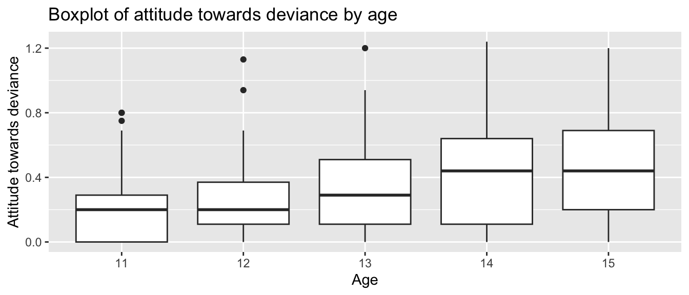
Just to get a sense of the data, let’s plot each age as a boxplot
ggplot(nys1, aes(age_fac, ATTIT)) +geom_boxplot() +labs(title ="Boxplot of attitude towards deviance by age", x ="Age", y ="Attitude towards deviance")
Note: The boxplot’s “x” variable is the group. You get one box per group. The “y” variable is the data we are making boxplots of.
Note some features of the data:
First, we see that ATTIT goes up over time.
Second, we see the variation of points also goes up over time. This is evidence of heteroskedasticity.
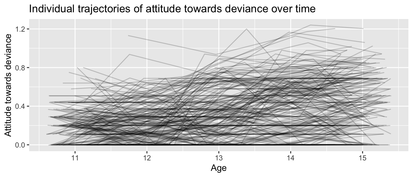
If we plot individual lines we have:
nys1 |>drop_na() |>ggplot(aes(age, ATTIT, group=ID)) +geom_line(alpha=0.2, position ="jitter") +labs(title ="Individual trajectories of attitude towards deviance over time",x ="Age",y ="Attitude towards deviance")
Note how we have correlation of residuals: some students have systematically lower trajectories and some students have systematically higher trajectories (although there is a lot of bouncing around).
library(tableone)# sample mean CreateTableOne(data = nys1,vars =c("ATTIT"))
                    Overall
  n                 1079
  ATTIT (mean (SD)) 0.33 (0.27)
# you can also stratify by a variables of interestCreateTableOne(data = nys1,vars =c("ATTIT"), strata =c("FEMALE"))
                   Stratified by FEMALE
                    0           1           p      test
  n                  559         520
  ATTIT (mean (SD)) 0.37 (0.27) 0.29 (0.27) <0.001
# you can also include binary variablesCreateTableOne(data = nys1, vars =c("ATTIT", "age_fac"), # include both binary and continuous variables herefactorVars =c("age_fac"), # include only binary variables herestrata =c("FEMALE"))
You can easily make pretty tables using the stargazer package, although there is a slight wrinkle in that it gets confused if you give it a “tibble” (from the tidyverse) instead of a “data.frame” (from base R). So you have to “cast” your data to data.frames to make it work:
library(stargazer)# to include all variablesstargazer( as.data.frame(nys1), header =FALSE, type="text")
=============================================
Statistic   N    Mean   St. Dev.  Min    Max
---------------------------------------------
ID        1,079 841.000 484.000    3    1,720
FEMALE    1,079  0.482   0.500     0      1
MINORITY  1,079  0.207   0.405     0      1
INCOME    1,079  4.100   2.350     1     10
age       1,079 13.000   1.400     11    15
ATTIT     1,079  0.330   0.272   0.000  1.240
EXPO      1,079 -0.002   0.301   -0.370 1.040
---------------------------------------------
You can include only some of the variables and omit stats that are not of interest:
# to include only variables of intereststargazer( as.data.frame( nys1[2:7] ), header=FALSE, omit.summary.stat =c("p25", "p75", "min", "max"), # to omit percentilestitle ="Table 1: Descriptive statistics",type="text")
Table 1: Descriptive statistics
===============================
Statistic   N    Mean  St. Dev.
-------------------------------
FEMALE    1,079 0.482   0.500
MINORITY  1,079 0.207   0.405
INCOME    1,079 4.100   2.350
age       1,079 13.000  1.400
ATTIT     1,079 0.330   0.272
-------------------------------
See the stargazer help file for how to set/change more of the options: https://cran.r-project.org/web/packages/stargazer/stargazer.pdf
To use stargazer in a PDF report, you would not set type="text" but rather type="latex" or type="html", and then in the markdown chunk header (the thing that encloses all your R code) you would say “results=‘asis’”.
5.2.1 Descriptive Statistics with the psych Package
Another package for obtaining detailed descriptive statistics for your data is the psych package in R which has describe(), a function that generates a comprehensive summary of each variable in your dataset.
If you haven’t already installed the psych package, you can do so using install.packages(). You then load the library as so:
# install.packages("psych")library(psych)
The describe() function provides descriptive statistics such as mean, standard deviation, skewness, and kurtosis for each variable in your dataset.
         vars    n   mean     sd median trimmed    mad   min     max   range
ID          1 1079 841.47 483.55 851.00  839.79 597.49  3.00 1720.00 1717.00
FEMALE      2 1079   0.48   0.50   0.00    0.48   0.00  0.00    1.00    1.00
MINORITY    3 1079   0.21   0.41   0.00    0.13   0.00  0.00    1.00    1.00
INCOME      4 1079   4.10   2.35   4.00    3.87   2.97  1.00   10.00    9.00
age         5 1079  13.04   1.40  13.00   13.05   1.48 11.00   15.00    4.00
age_fac*    6 1079   3.04   1.40   3.00    3.05   1.48  1.00    5.00    4.00
ATTIT       7 1079   0.33   0.27   0.29    0.31   0.27  0.00    1.24    1.24
EXPO        8 1079   0.00   0.30  -0.09   -0.03   0.27 -0.37    1.04    1.41
          skew kurtosis    se
ID        0.01    -1.18 14.72
FEMALE    0.07    -2.00  0.02
MINORITY  1.45     0.09  0.01
INCOME    0.79     0.03  0.07
age      -0.04    -1.27  0.04
age_fac* -0.04    -1.27  0.04
ATTIT     0.63    -0.36  0.01
EXPO      0.88     0.31  0.01
The describe() function generates a table with the following columns:
vars: The variable number.
n: Number of valid cases.
mean: The mean of the variable.
sd: The standard deviation.
median: The median of the variable.
trimmed: The mean after trimming 10% of the data from both ends.
mad: The median absolute deviation (a robust estimate of the variability).
min: The minimum value.
max: The maximum value.
range: The range (max - min).
skew: The skewness (measure of asymmetry).
kurtosis: The kurtosis (measure of peakedness).
se: The standard error.
5.2.2 The skimr Package
Another package that provides a comprehensive summary of your data is the skimr package. It is more about exploring data in the moment than report generation, however.
One warning is skimr can generate special characters that can crash a R markdown report in some cases–so if you are using it, and getting weird errors when trying to render your reports, try commenting out the skim() call. Using it is simple:
skimr::skim( nys1 )
Data summary
Name
nys1
Number of rows
1079
Number of columns
8
_______________________
Column type frequency:
factor
1
numeric
7
________________________
Group variables
None
Variable type: factor
skim_variable
n_missing
complete_rate
ordered
n_unique
top_counts
age_fac
0
1
FALSE
5
13: 230, 14: 220, 15: 218, 12: 209
Variable type: numeric
skim_variable
n_missing
complete_rate
mean
sd
p0
p25
p50
p75
p100
hist
ID
0
1
841.47
483.55
3.00
422.00
851.00
1242.00
1720.00
▇▇▆▇▆
FEMALE
0
1
0.48
0.50
0.00
0.00
0.00
1.00
1.00
▇▁▁▁▇
MINORITY
0
1
0.21
0.41
0.00
0.00
0.00
0.00
1.00
▇▁▁▁▂
INCOME
0
1
4.10
2.35
1.00
2.00
4.00
5.00
10.00
▇▇▅▂▂
age
0
1
13.04
1.40
11.00
12.00
13.00
14.00
15.00
▇▇▇▇▇
ATTIT
0
1
0.33
0.27
0.00
0.11
0.29
0.51
1.24
▇▅▃▂▁
EXPO
0
1
0.00
0.30
-0.37
-0.27
-0.09
0.20
1.04
▇▃▃▁▁
5.3 High School and Beyond Example
For this part, we’ll use the HSB data to illustrate summarizing variables by group (in our case, school).
# load data dat <-read_dta("data/hsb.dta")
5.4 Summarizing by group
To plot summaries by group, first aggregate your data, and plot the results. Like so:
`stat_bin()` using `bins = 30`. Pick better value with `binwidth`.
5.5 Diagnostic plots
We can also make some disagnostic plots for our model. first, let’s fit a random intercept model.
m1 <-lmer(mathach ~1+ ses + (1|schoolid), data=dat)arm::display(m1)
lmer(formula = mathach ~ 1 + ses + (1 | schoolid), data = dat)
            coef.est coef.se
(Intercept) 12.66     0.19
ses          2.39     0.11

Error terms:
 Groups   Name        Std.Dev.
 schoolid (Intercept) 2.18
 Residual             6.09
---
number of obs: 7185, groups: schoolid, 160
AIC = 46653.2, DIC = 46637
deviance = 46641.0
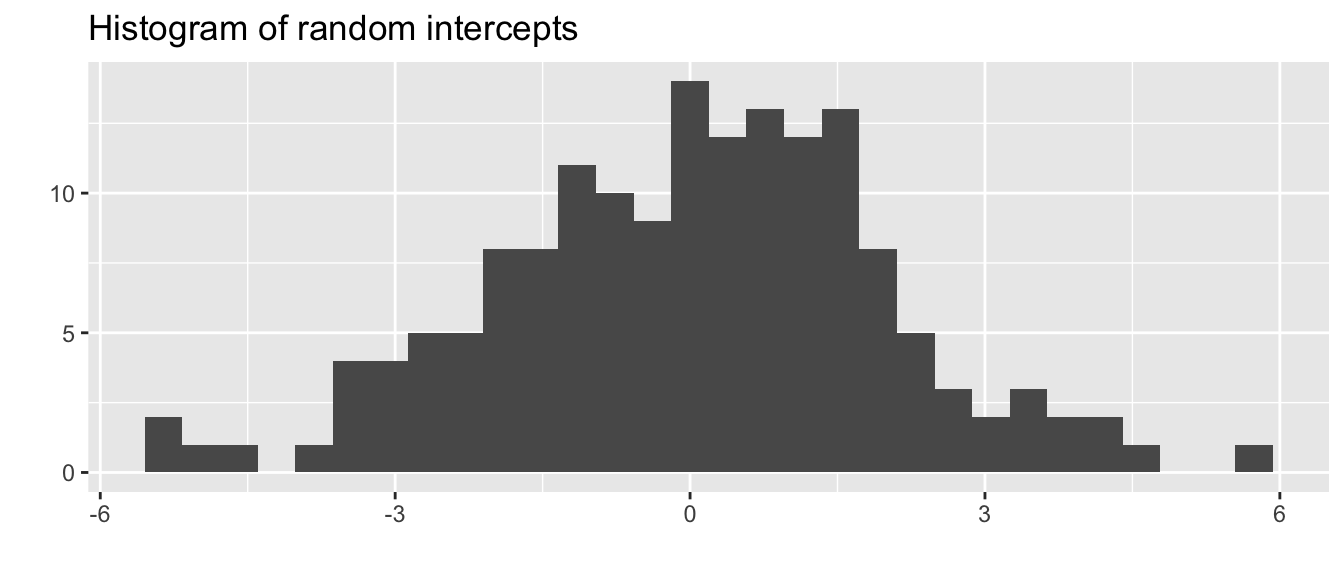
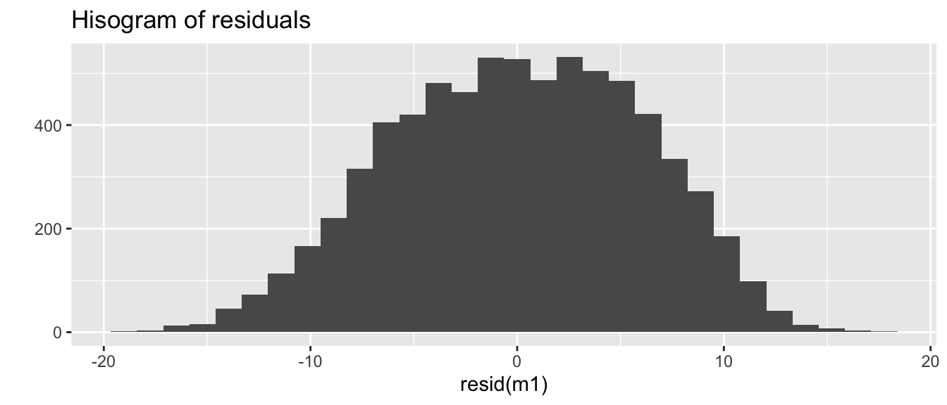
We can check if some of our assumptions are being grossly violated, i.e. residuals at all levels are normally distributed.
qplot(ranef(m1)$schoolid[,1],main ="Histogram of random intercepts", xlab="")
`stat_bin()` using `bins = 30`. Pick better value with `binwidth`.
qplot(resid(m1), main ="Hisogram of residuals")
`stat_bin()` using `bins = 30`. Pick better value with `binwidth`.
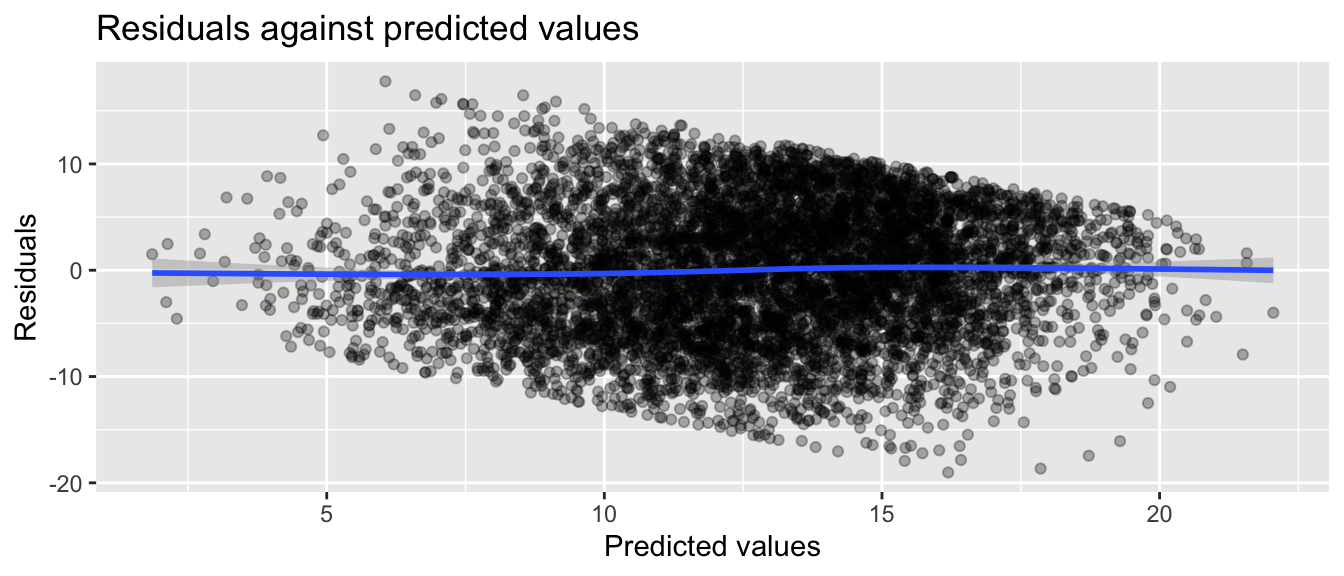
We can check for heteroskedasticity by plotting residuals against predicted values
dat$yhat =predict(m1) dat$resid =resid(m1)ggplot(dat, aes(yhat, resid)) +geom_point(alpha=0.3) +geom_smooth() +labs(title ="Residuals against predicted values",x ="Predicted values", y ="Residuals")
`geom_smooth()` using method = 'gam' and formula = 'y ~ s(x, bs = "cs")'
It looks reasonable (up to the discrete and bounded nature of our data). No major weird curves in the loess line through the residuals means linearity is a reasonable assumption. That being said, our nominal SEs around our loess line are tight, so the mild curve is probably evidence of some model misfit.
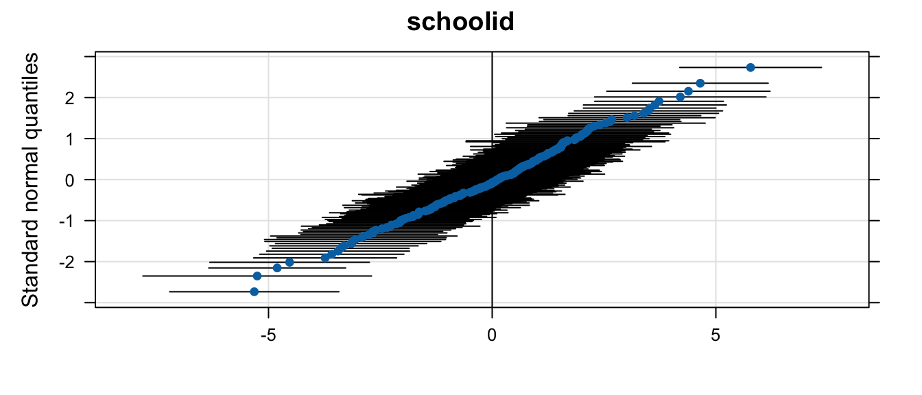
We can also look at the distribution of random effects using the lattice package